Kazakhstan Travel is the official tourist site of Kazakhstan created for promoting of the country and attraction of foreign tourists. The "Rocket Firm" designed and shaped all pages of the website, imposed templates.
In designing we combined national color and modern graphic means. On the homepage visitors are welcomed with a list of sightseeing, description of cultural features of the country and responses to routine, but important questions: how to get there, do we need a visa, exchange rate etc.
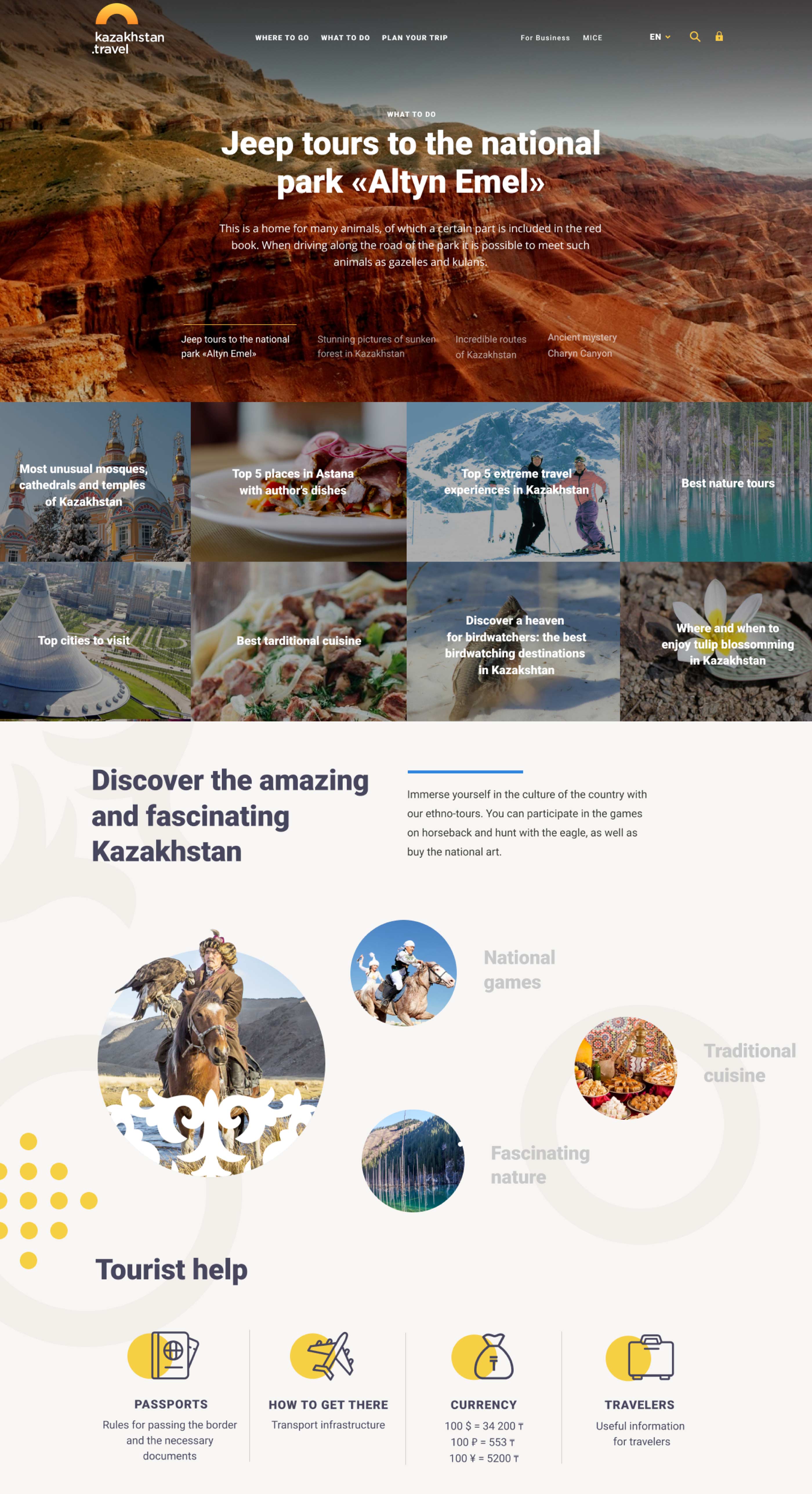

For users
We designed convenient navigation according to sections: where to go or what to visit, what to do and how to plan a trip. “Where to go” is a city or a region. “What to do” is regarding entertainments for those for whom a leisure type is important, but not a region. “Plan your trip” is regarding important information for a tourist: crossing a border, visa, currency, lists of guides and shops.
The major on the website is articles with illustrations, therefore we created some beautiful previews and styles convenient for reading: headings, text and their composition.
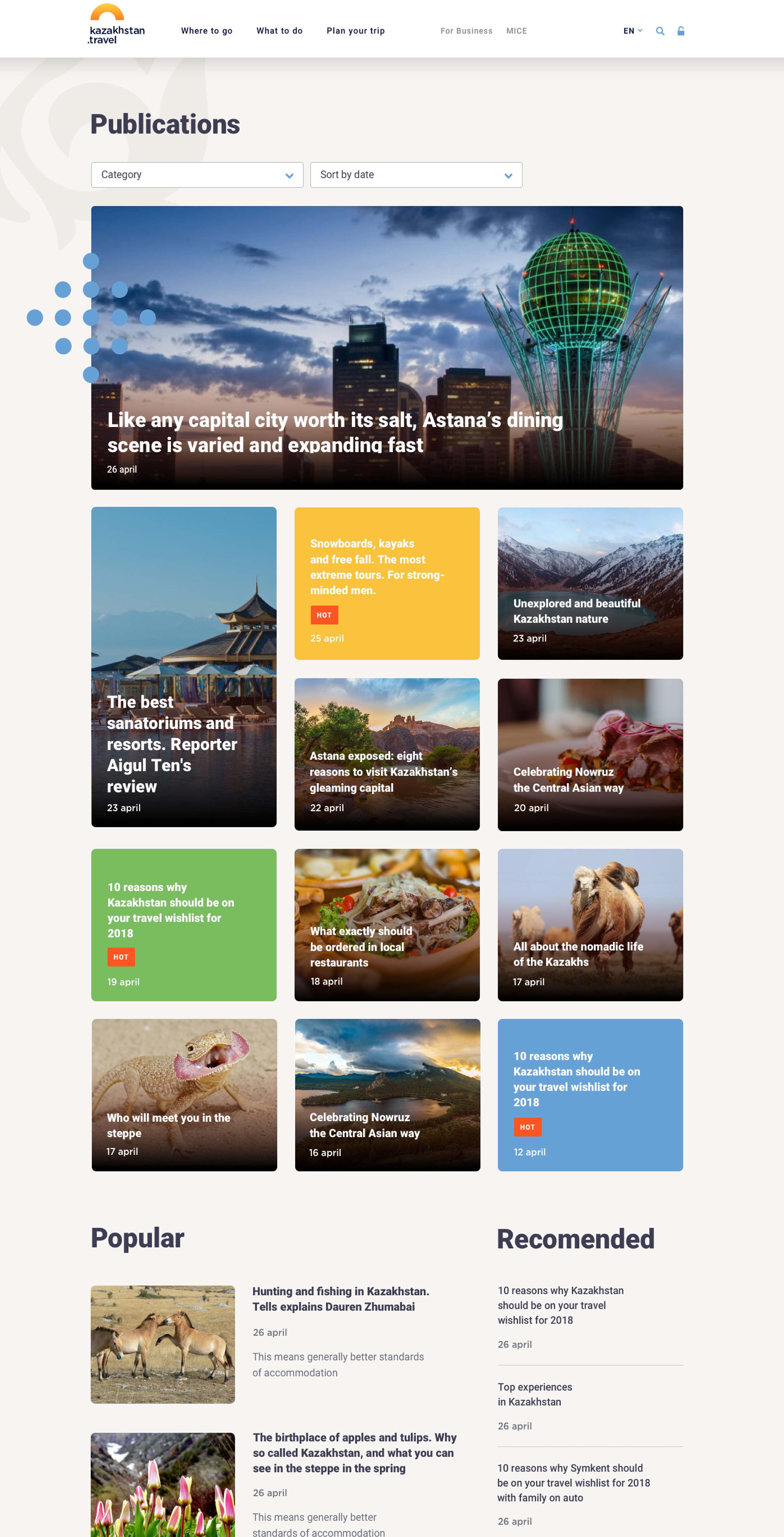

For business
The website is aimed not only at tourists, but also at local businessmen. We designed three types of personal offices: for a guide, a tour operator and a gift shop. A special designer helps tour operators and guides create a route, specify prices for different categories of tourism, and tell souvenir shops about assortment and location.
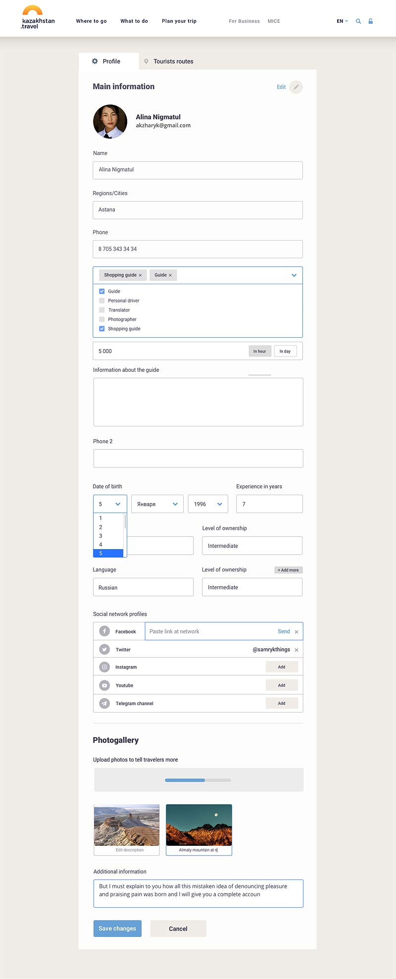
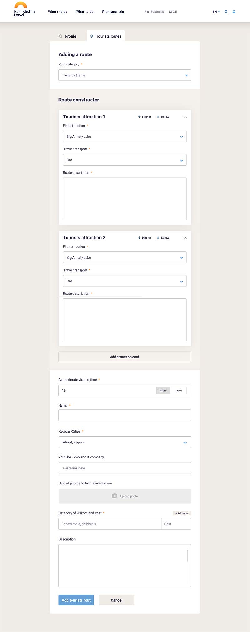
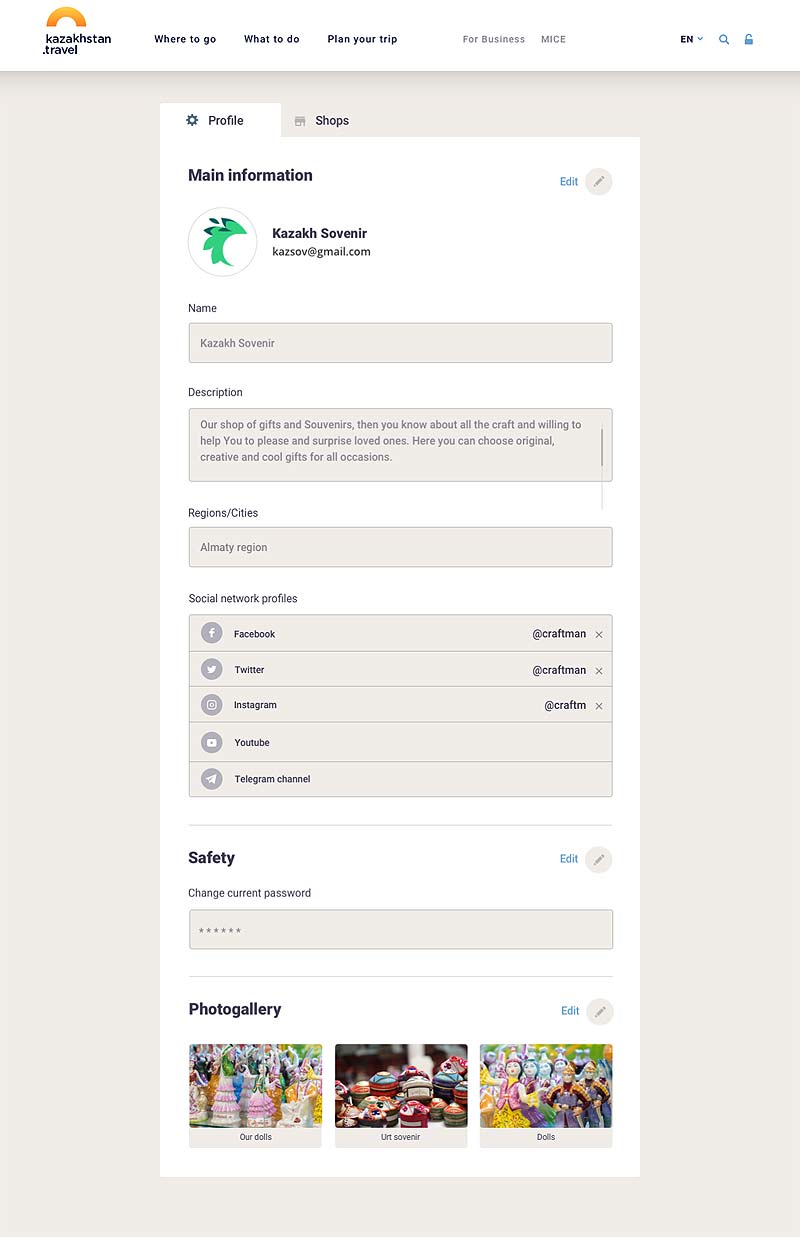

Total developed three dozen screens and states. The site works equally well on stationary and laptop computers, tablets and smartphones.
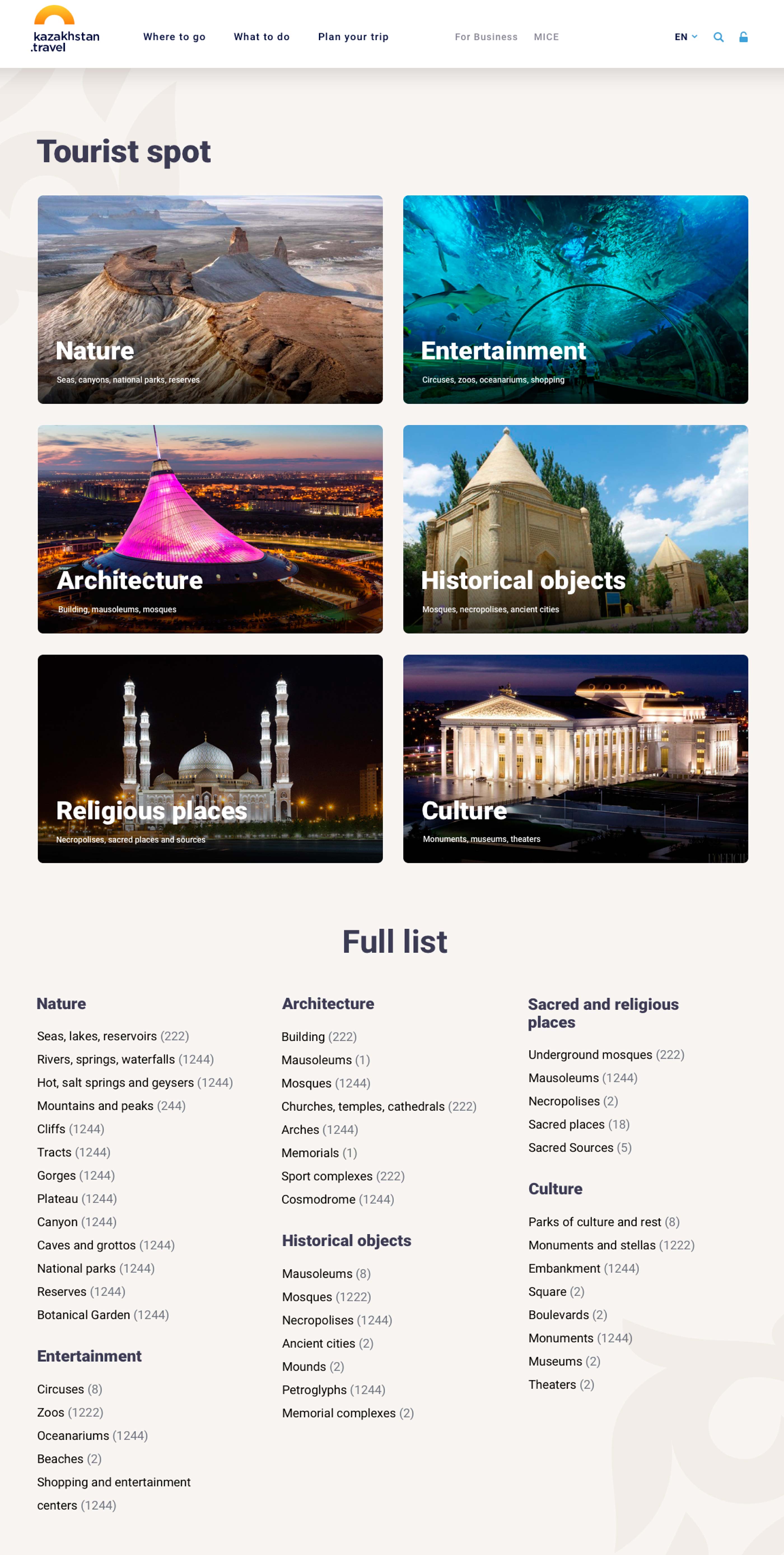
Programming of the website, its content and support are made by the customer's forces.


